


uring the past years, we have been trying to improve our design process in order to make the team more productive, shorten design lead time, and decrease the cost of changes. Since the design tools which have strong collaboration features released, such as Figma and recently – Sketch announced they are going to release a public beta of Sketch for Teams this July 2019, the question is how should we (as designers in a team) approach the process to be more effective?
Before we start, let’s make a quick recall of the User Interface design evolution with Atomic design and Collaborative design tools.
Atomic design
“Atomic design provides a clear methodology for crafting design systems. Clients and team members are able to better appreciate the concept of design systems by actually seeing the steps laid out in front of them.” — Brad Frost
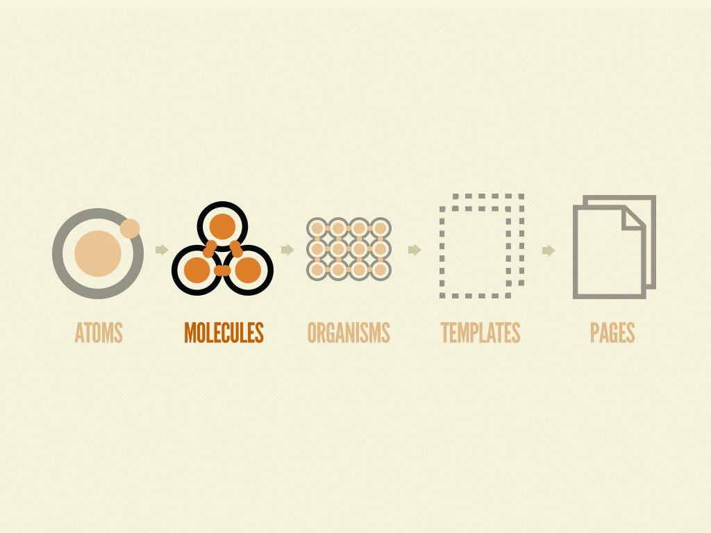
A long time ago, when Adobe first released the Creative Cloud Library and lots of designers use Adobe Photoshop or Illustrator to create prototypes, Creative Cloud Library completely changed the way we design. With the shared library, we can easily add a single layer or group of layers and reuse it in different places of the design. The shared library allows other users from the team to modify the items and apply changes consistently.
Nowadays, Figma (and Sketch) made it to the next level by creating a Components system. The designers can create components and reuse them with flexibility (Aspects or Constraints system) and maintainability (change the Master Component while still maintaining the aspects of Instances).
Collaborative design tools
I had been using Adobe Photoshop, Adobe Illustrator, Sketch, Adobe Xd for years, and recently, Figma to create User Interface design for commercial projects. What I really like about Figma is the ability to have multiple designers and stakeholders (developers, clients, etc.) involve in a project at the same time, as product design is a collaboration process, it is always beneficial when we have the contribution of different people from their standpoints.
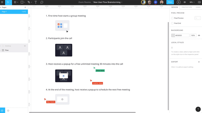
With Figma, our team members can work on the same file at the same time, but how can we assign the work smartly so that our designers can (1) work in parallel, (2) inherit the work from others and (3) avoid conflicts, duplications?
Having opportunities to work with different design teams from various size companies, I know some of us (including me) used to (or still) assign the UI works by screens. Basically, when we finish the wireframe, we assign the work for team members by screens to create a pixel-perfect UI design. Doing this can sometimes lead to Inconsistent design, time-consuming for reviewing, and causing conflicts (especially with the companies/clients who don’t have a solid design system).
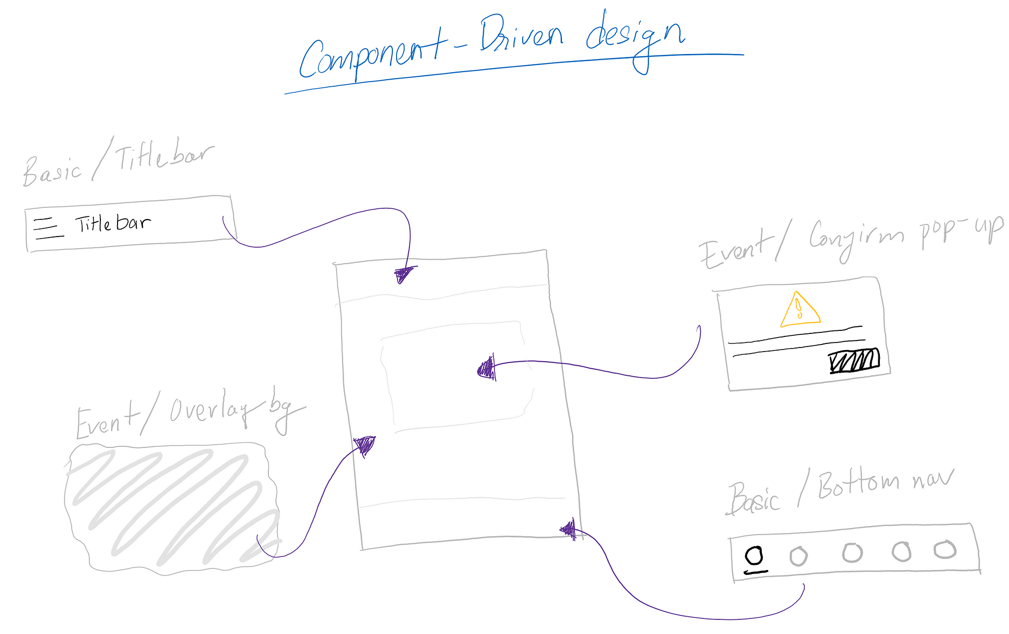
The answer is Component-driven strategy
A Component-driven strategy is a way we approach the User Interface design process from the component level.
Approaching the design from the component level has some benefits:
- Continuously complete the design system and components library for the client, long-term beneficial
- The designers can work independently in the library, reduce downtime (waiting for others outputs)
- Create consistent design because of reusing inheritable components library
Before starting applying this strategy, we need to have:
- A typical design system to be the basic rules for the design development
The basic design system includes:
- Typography, color-scheme and basic shapes to maintain the brand identity from clients
- Minimum assets library: basic icons, like a menu, close, checkmark, arrows, etc. more icons can be added while we are building with the components
- Grid templates (8 points grid, responsive grid, etc.)
- Screen templates: Global templates define locations of the header, footer, body for web or title bar, navigation, content for mobile app.
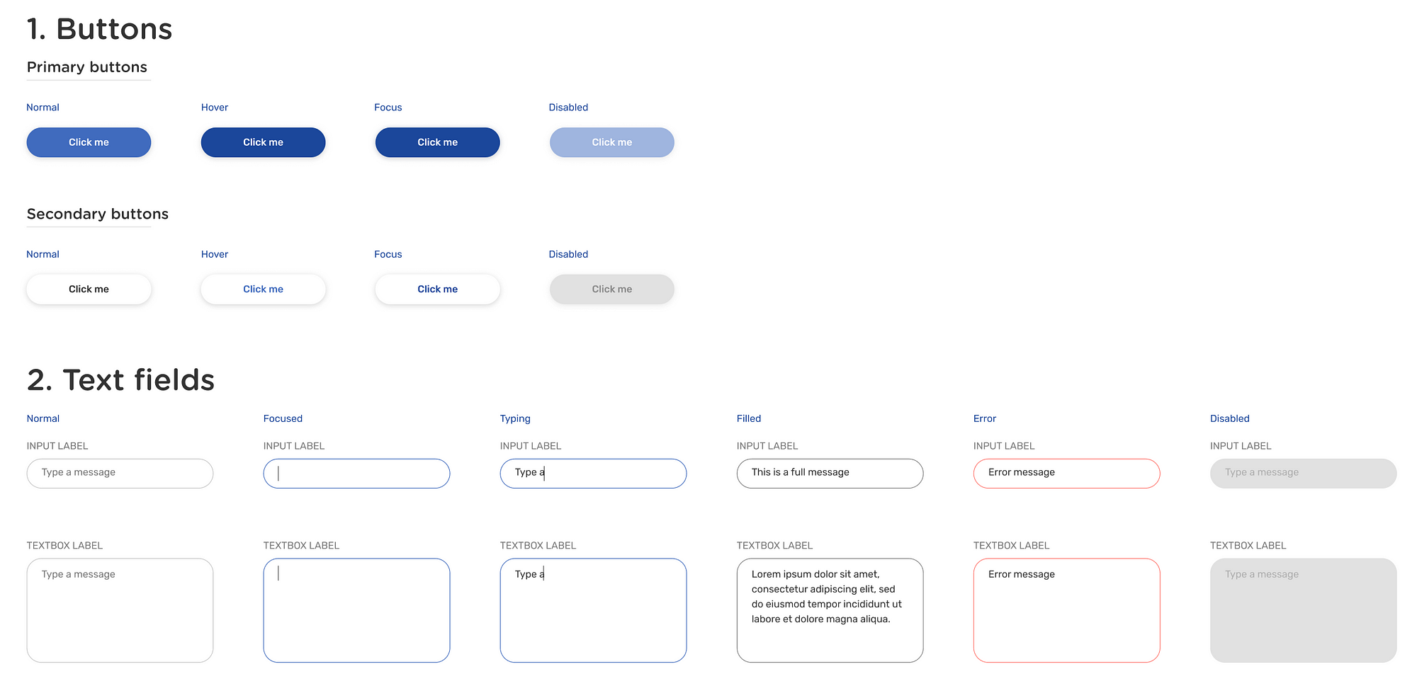
- Basic components: Buttons, Label, Text-fields
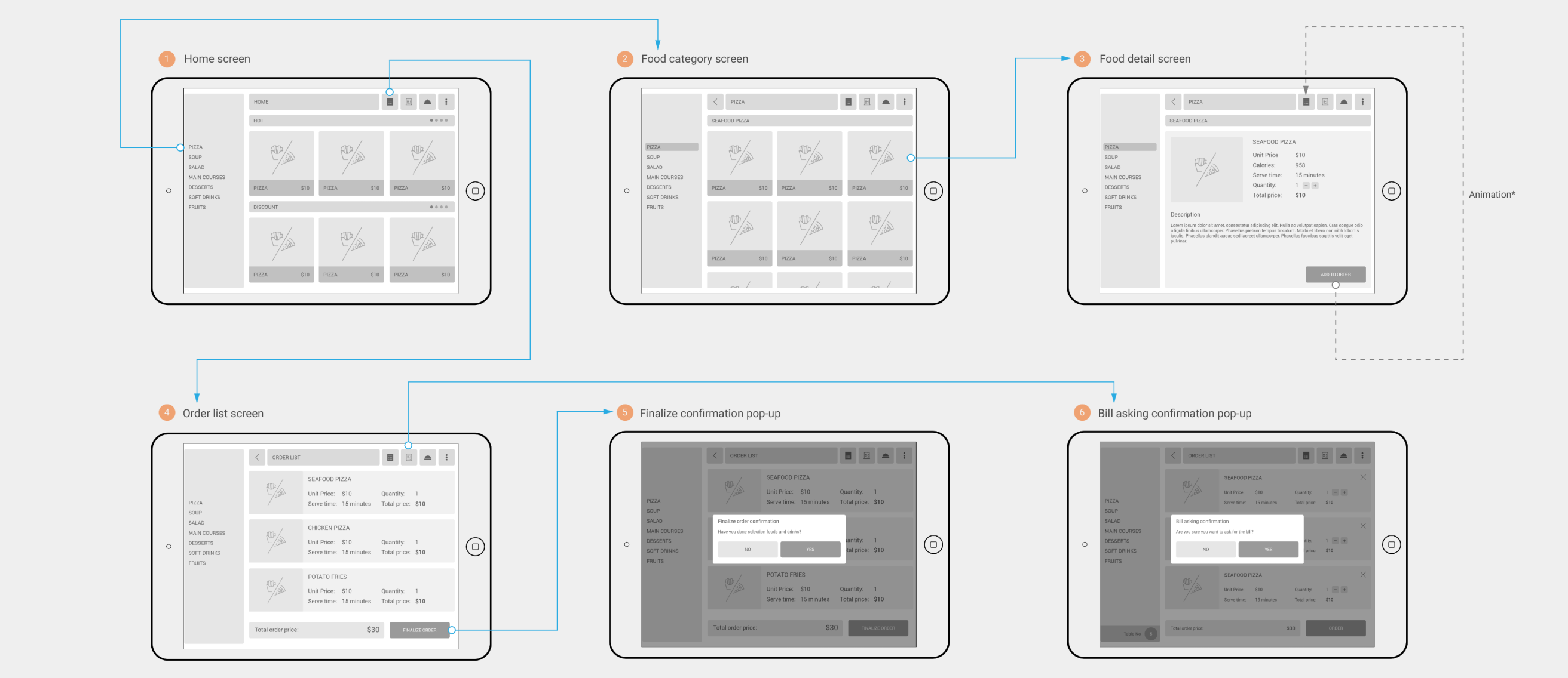
2. A wireframe (low/mid-fidelity) or a part of the wireframe (as we are in the Agile world), as an architecture for the design.
The wireframe includes user-flow provides team members with a conceptual overview of the application. As we are approaching the design from component-level, having a conceptual overview helps the designers follow the same goal and ensure consistency in the design.
When you have the above items ready, it’s time to get started:
Firstly, build up your components back-log
From the wireframe, you can easily list down the components that need to be built. A Components backlog with prioritizations will help to keep track of the workload and the status of components, also keep the item accountable for maintenance in the future.
Let’s try to categorize the component by its functions or characteristics:
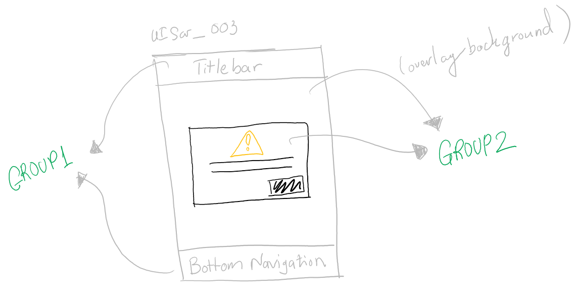
- Basic components: The very basic items such as title bar, bottom navigation, tab-navigation, etc.
- Event components: Pop-up, notification, toast messages, error messages, loading indicator…
- State components: Downloading, updating, loading…
- Function components: Conversation bubbles, map, charts, etc. depending on the product’s requirements

Next, assign the defined components group to your designers
Now depending on the number of designers, experience, and the scope of the project, you can assign designers to handle the component groups from the defined backlog. The designer will be in charge of building, publishing, and maintaining the components following the product development life cycle.
And lastly, start Lego-ing to make the screen designs — Easy game!
When you have all the needed components built, the remaining task is just doing drag-n-drop the components to build the screen design based on the wireframe. When you have all the necessary components ready, this task is just a breeze.
Keep in mind:
- UX oriented from the component level: Although this is more a User Interface design process, the designer who builds the component need to consider carefully, make sure the component can be reused app-wide with flexibility. The component also needs to be optimized to bring the best experience to the user.
- Don’t forget different states of components, some components have multiple states so the designer who got assigned has a responsibility to cover all of them.
I believe applying Component-driven process will improve our design process from some aspects. However, whatever we use, always keep in mind that the process needs to be modified based on the characteristics of the team, the scope of the project, and the available resources, to make sure we can deliver the best quality of the product.
If you have experience optimizing the product design processes, specialized in Software development, don’t be hesitate to share your thoughts. Mahalo!